Contest Entries - The entries to last issues cover contest
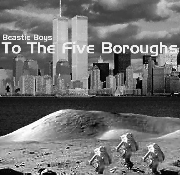
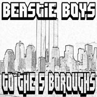
Entry 01
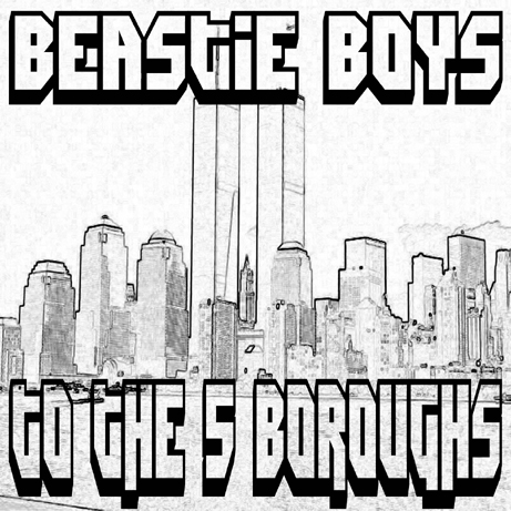
This CD cover is for the To The Five Boroughs CD. I created it using Photoshop using a astronomy.com picture from the moon as the foreground. I then put an old picture of new york behind it and split the cover into top and bottom. I then put Beastie Boys To The Five Boroughs as text. The font I used is called "do whatchalike".
-FB
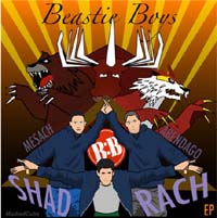
Entry 02
In this cover design, I wanted to show the Beastie in Beastie Boys, so I started illustrating all 3 Beasties in their familiar triangle pose. Then I drew the 3 forces shown in the Shadrach video in the background. I was going for a power ranger like thingy where they would be in front and it seems like they summoned the forces to do battle or something. I also putted a triangle behind the Beasties to unify the formation, and putted the 3 words Shadrach, Mesach and Abendago on each side of the triangle to flow the Beasties and the forces together. I made the word Shadrach stand out, because it's the name of the song I'm basing the cover on. I added beams of light in the background to give it a flashy action look. There were 2 areas that were empty, so on the top I wrote the words Beastie Boys in a mythical font. The second area was the empty black space inbetween the boys, there I putted the B-Boy logo off the Alive single in there. That's about it, in the end I think it came out great.
- Marked Cube
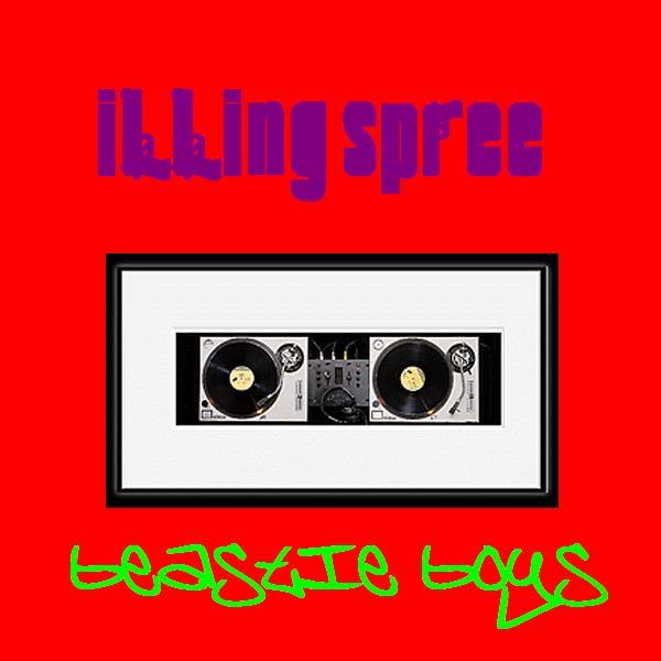
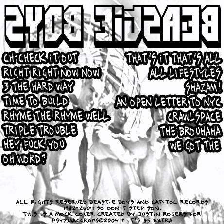
Entry 03
This cover was made using MS Paint, simple as that. I got the picture of the decks off a Google image search I think, then cut them out and put them in the frame. I looked around the net for a while for the Sopranos style font and the graffiti one (I think it is Brooklyn Kid or something).
- The Padster

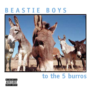
Entry 04
This is a little smaller than you'd asked, but you'll get the idea.
The cover photo was taken from an internet search for burros. One burro (far left) had to be 'shopped in, but otherwise, the image was good to go. I like it, because the fish eye lens reminds me of some of the Beastie Boys' videos.
The typeface is Lucida Console, if I remember correctly.
Here you go -- hope you like it.
- David Dwyer

Entry 05
Yeah I pretty much used that drawing that was up on Beastieboys.com for like a day and then Got the Beastie Boys logo. The font is something from Dafont.com and the little asterisk below it is from dafont.com too...I think it was like DJ Underground and Slashes are the names of the fonts...Anyways I'm totally using my cover instead of the official one seeming that mine is more emotional (IMHO)...Created in Photoshop.
- BCNHF
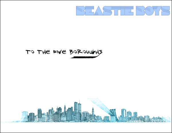
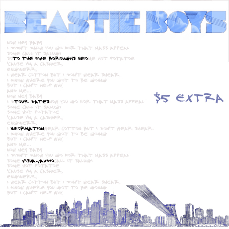
Entry 06
I used the image from "Alright read this Issue #1" for the back cover changing it to a grayscale image and bleeding the white a little bit while also softening the tones.
The font for the tracks is a tag font with a black border and the title and Beastie Boys lettering was inspired by the pre-pre-launch Beastieboys.com websites and the shaft movies.
The front cover is a picture of the new york city skyline that has been made grayscale and the through filters made to look like a line drawing
- Justin RogersAnd the winner is....Entry 02 by Marked Cube!
You win a Beastie Boys pack of 5 stickers and a poster. You should receive it in 2-3 weeks.